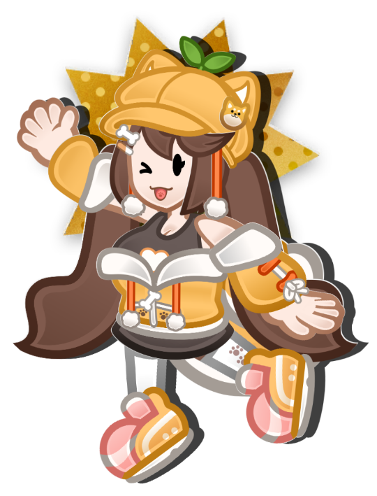
For whatever reason you'd like to contact me, please email me here using the fill out form below. I check this email every Monday! If you have a business inquiry or interest, please contact this email instead, my manager will speak to you! Business Email: [email protected]
Note: Emails in regards to commissions or mod requests will be ignored.
For Merch inquiries, please use the contact email on the respective site (there are multiple merch stores).
Rules for Emailing me:
Please do not send me anything inappropriate, drama-related, or anything you feel is a non-issue. I can't go through every email and sometimes, I *will* read them on stream if they are not NDA. So don't send anything embarassing to me please. This is your warning!
Obviously do not send me NSFW, Gore, etc. Basically anything horrible / not stream appropriate.
Galleries have a few options that can be toggled by setting the custom CSS class on gallery block. First it should be noted that the columns slider on the right side bar is ignored and the images on the gallery will always be laid out with a fixed size.
Gallery Image Size
Images in the gallery are fixed size. For the time being the only aspect ratio is square, but there are some options that can be defined. These are currently available but more can be added if necessary.
width-100
width-150
width-200 (default if not specified)
width-250
In addition, the toggle for Crop Images to Fit should still work and toggles between the default of aspect-fit to aspect-fill. The above examples are the default. Toggling this option on will opt to fill the area with the potential to cut parts of the image off, as shown in the example below.
crop images to fit
Wrap Alignment
As you might have seen above, depending on how many items are in the gallery, the images will naturally wrap if they can't all fit on the same line. While the wrapping is automatic, you can define how the items are aligned (as well as how the row starts filling up). The default option, if none specified, is to be center aligned. This can be adjusted with the appropriate custom CSS class on the gallery.
center-aligned (default if not specified)
left-aligned
right-aligned
Images
Images in most contexts do not have any additional functionality attached to them. However, they can be made to expand when clicked on. To do this, the individual image should be selected and given the custom CSS class expandable-image. This can be on standalone images or images within a gallery.
This image also has a caption, but will not show up by default.
This is the caption for the Pokemon Heart Gold image. By default, this caption is only visible when expanded, but can be made to appear all the time, if desired, by giving the image the custom CSS class caption-always-visible. This is not possible for images in a gallery, but images in a gallery can still be given a caption that appears when expanded.
Captions can be added to any image. Note that captions will not appear by default on gallery images like the example below. If the image in the gallery is marked as an expandable-image, then the caption will appear when the image is clicked on.
This is Fire Emblem: Path of Radiance.This is Metroid Prime.This is Pikmin.This is Pokemon Colosseum.
Gallery
Galleries have a few options that can be toggled by setting the custom CSS class on gallery block. First it should be noted that the columns slider on the right side bar is ignored and the images on the gallery will always be laid out with a fixed size.
Gallery Image Size
Images in the gallery are fixed size. For the time being the only aspect ratio is square, but there are some options that can be defined. These are currently available but more can be added if necessary.
width-100
width-150
width-200 (default if not specified)
width-250
In addition, the toggle for Crop Images to Fit should still work and toggles between the default of aspect-fit to aspect-fill. The above examples are the default. Toggling this option on will opt to fill the area with the potential to cut parts of the image off, as shown in the example below.
crop images to fit
Wrap Alignment
As you might have seen above, depending on how many items are in the gallery, the images will naturally wrap if they can't all fit on the same line. While the wrapping is automatic, you can define how the items are aligned (as well as how the row starts filling up). The default option, if none specified, is to be center aligned. This can be adjusted with the appropriate custom CSS class on the gallery.
center-aligned (default if not specified)
left-aligned
right-aligned
Images
Images in most contexts do not have any additional functionality attached to them. However, they can be made to expand when clicked on. To do this, the individual image should be selected and given the custom CSS class expandable-image. This can be on standalone images or images within a gallery.
This image also has a caption, but will not show up by default.
This is the caption for the Pokemon Heart Gold image. By default, this caption is only visible when expanded, but can be made to appear all the time, if desired, by giving the image the custom CSS class caption-always-visible. This is not possible for images in a gallery, but images in a gallery can still be given a caption that appears when expanded.
Captions can be added to any image. Note that captions will not appear by default on gallery images like the example below. If the image in the gallery is marked as an expandable-image, then the caption will appear when the image is clicked on.
This is Fire Emblem: Path of Radiance.This is Metroid Prime.This is Pikmin.This is Pokemon Colosseum.